Forms
| Severity | Serious |
|---|---|
| Accessibility Principle | Operable |
| Affected users | Visual, Mobility, Cognitive |
| Success criterion | 3.3 |
Forms collect input from users — email addresses, passwords, search queries, settings. For screen reader and keyboard users, an inaccessible form is one of the most common blockers: unlabelled fields, validation errors that aren't announced, and focus traps can make a form impossible to complete.
Expectations
- When: A form field receives focus
- Then: The label, input type, and any validation error are all announced together — users should not need to navigate elsewhere to hear the error
- When: The user finishes entering a value
- Then: The user can advance to the next field or submit the form using a keyboard action, without being forced to swipe
- When: The user pronounces a field label
- Then: Voice Control focuses the field
- And:
- The user can dictate input directly — field labels must match their visible text so voice targeting works
- And:
- Then: Voice Control focuses the field
Labels
Severity: CriticalSuccess criterion: 3.3.2
Labels describe the purpose and function of form elements; and are critical for users who cannot determine this by looking at the form.
- All form controls, such as text fields, checkboxes, radio buttons, etc., must each have a unique label
- Placeholders must not be used as a substitute for a label; as they are only visible if the field is empty
Expectations
- When: A form field receives the focus
- Then: Reads the label
- And: Reads the input type
<TextInput accessibilityLabel="Enter your email address" />
| VoiceOver | Talkback |
|---|---|
| Enter your email address, edit box, double tap to edit text |
Grouping
For some form controls, such as text fields, the label should not be focusable individually, as it would provide redundant information, but the Text field must provide an accessibilityLabel instead.
<Text
    importantForAccessibility="no"
    accessibilityElementsHidden="true">Enter your email address</Text>
<TextInput accessibilityLabel="Enter your email address" />
If the field is required the accessibility label should not end with an asterisk, but a required message should be provided instead.
<Text
    importantForAccessibility="no"
    accessibilityElementsHidden="true">Enter your email address*</Text>
<TextInput accessibilityLabel="Enter your email address, required" />
Errors
Severity: SeriousSuccess criterion: 3.3.1
If the field has an error, then this should be read as part of the field label/hint itself and should not be focused as an isolated component:
This is because if we keep the information in a separate component, the user won't be aware of the error unless it does swipe to select the next element. Also, some users might forget the error, forcing them to swipe left and right to figure out that.
Expectations
- When: The user focuses a form field with a failed validation
- Then: Reads the field valud
- And: Reads the input type
- And: Reads the validation error

| VoiceOver | Talkback |
|---|---|
| Email address, edit box, please enter a valid email, ... |
Focus on the next field
Severity: SeriousWhen on TextInput, the user should be able to access the next field or submit the form using the specific keyboard button; please don't force them to swipe to do that.
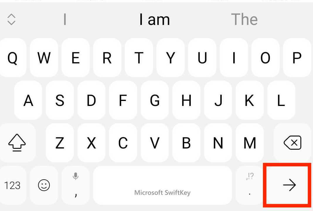
The built-in TextInput automatically handles the returnKeyLabel property and its action.
Keyboard trap
Severity: SeriousThe user must be able to navigate to all the interactive elements on the screen and navigate away from them at any moment without becoming trapped.
For example, if the user decides to navigate away from an input field, it must be allowed to do so; even if the field contains invalid data, it doesn't matter in no way the focus should be programmatically forced back to that field!
Form submission
Severity: SeriousThe user should be able to submit a form using the done button on the keyboard if a text input has it.
Also, an error message should be displayed and autofocused when it fails to let the screen reader know about the issue. Alternatively, the first failed field should be autofocused if no message is available.
Best Practices
Label every field — never rely on placeholder text
Placeholders disappear as soon as the user starts typing. Every field must have a persistent accessibilityLabel. If the visual label is a separate <Text> element, hide it from the accessibility tree and put the label text on the TextInput instead.
Include validation errors in the field's label or hint
Don't display errors as separate focusable elements. Attach them to the field itself so the screen reader announces the error immediately when the field receives focus — users should not need to swipe to find out what went wrong.
Mark required fields in the label, not with an asterisk
An asterisk is a visual convention that screen readers may not convey meaningfully. Use "required" as part of the accessibilityLabel:
<TextInput accessibilityLabel="Email address, required" />
Never trap focus in a field
If the user wants to leave an input — even one with invalid data — let them. Programmatically forcing focus back to a field is a keyboard trap and fails WCAG 2.1.2.
Autofocus the error summary on failed submission
When form submission fails, move focus to the error summary or the first failed field so screen reader users are immediately informed of what needs fixing.
AMA dev runtime errors
INPUT_HAS_NO_VISIBLE_LABEL
This error is used when no label has been provided for the TextInput component.
NO_FORM_ERROR
This error is used when no error has been provided for the TextInput component.
INPUT_HAS_FOCUSABLE_LABEL
This error is raised when the visible label for a TextInput is focusable separately from the field, causing screen readers to announce it twice.
This rule can be disabled by turning off the forms check in the ama.config.json file.
INPUT_HAS_NO_VISIBLE_LABEL_ENDING_WITH_ASTERISK
This error is raised when the accessibility label for a TextInput ends with an asterisk. Asterisks are a visual convention that screen readers do not reliably convey — mark required fields with "required" in the label text instead.
This rule can be disabled by turning off the forms check in the ama.config.json file.
INPUT_INVALID_RETURN_KEY
This error is raised when a TextInput uses the default Return key, which dismisses the keyboard instead of advancing to the next field or submitting the form.
This rule can be disabled by turning off the forms check in the ama.config.json file.
NO_KEYBOARD_TRAP
This error is triggered by the TextInput component if the next input field does not have the focus as expected.
This rule cannot be turned off!